No doubt, the color that comes first to mind when you think about garden roses is probably a blush pink or peach or creamy white—the perfect choice for classic wedding design. But today, wedding palettes are trending brighter and more vibrant, and garden roses are coming into wider use for all kinds of floral designs—whenever the occasion (or non-occasion) warrants something special. 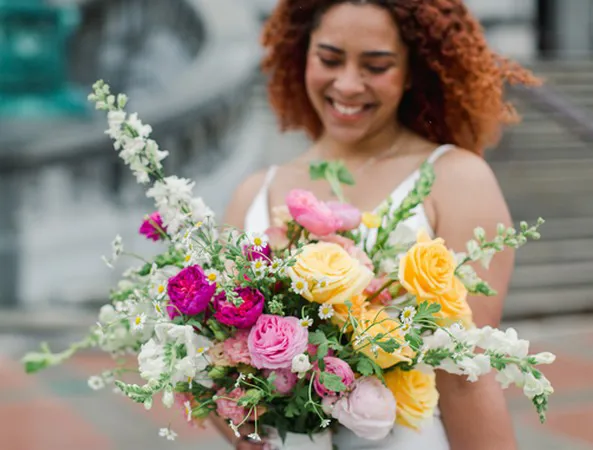
Fortunately, garden roses come in almost all the colors of the rainbow, from delicate tints to rich tones and eye-popping brightness. And let’s not forget the quality that makes garden roses so versatile a component in all kinds of color combinations: blended hues that can range in one flower from soft to saturated (think Beatrice (Auslevity) or Effie (Ausgray), with pale outer petals and buttery interiors) or transition from one hue to another—say, pink to peach (Miyabi) or from bright salmon to bubblegum pink (Rosa Loves Me (Just a Little Bit More)). 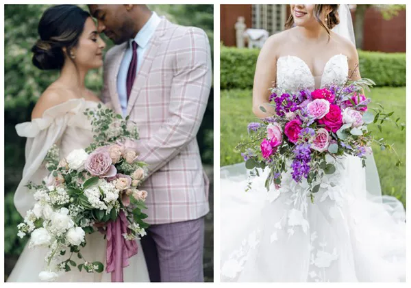
Wedding palettes go wild
Look at some of the latest wedding palette trends, as revealed by experts at The Knot, and it’s remarkable how they line up with the colors of garden roses. It’s almost as though the colors of the roses have influenced the trends—which, of course, they have.
Lilac and lavender are coming on strong, in fresh new color combinations. Lavender roses like Tiara, Princess Kaori (Fragrant), or our new Wabara garden spray rose Sola are pairing up with candy-colored pastels like soft pinks, pale greens, and lemony yellows.
Indeed, yellow is coming into its own as a cheerful, surprisingly harmonious accent color. At her studio Revelation Design in Florida, Brooke Raulerson, AIFD, FSMD, recently did a wedding all in lavenders, whites and yellows, with Catalina lending its creamy, citrusy hue to the mix. “It lasted beautifully and was a big hit with everyone at the wedding,” said Brooke.
Yellow and lavender both make cozy companions to light blue, another trending color for wedding celebrations. Light blue also pairs well with hues such as burgundy or rusty orange—colors often favored for fall weddings and abundant in the garden rose palette, from wine-red Darcey (Auschariot) or Tess (Ausyacht) to the aptly named Sunset.
According to The Knot, a tasty, sherbet-y orange—they’re calling it papaya orange—is the latest variation on salmon, coral or peach. Free Spirit and Princess Aiko (Beloved) both meet the description of this color, perfect for pairing either with earthy neutrals or with vivid brights.
And brights are in a trend category all their own, a throwback to the eighties and nineties (with appeal, therefore, to millennials). Vivid pinks like Ashley, Pink Piano or Baronesse, tangy yellows like Catalina or Lemon Pompon, even bright reds like Piano or Wanted all fill the bill—not to mention, again, glowing orange garden roses like Free Spirit, Sunset or Princess Aiko.
“My favorite garden rose is Princess Aiko, with that vibrant orangey color in the center, pink on the outside,” says Brooke. “We sell a lot of it. It works with all kinds of bold colors.”
Neutrals, especially earthy, sandy tones like those found in Amnesia, Quicksand, Golden Mustard, Caramel Antike, Sahara Sensation or Westminster Abbey, remain among the most popular choices for 2021 and beyond, earthy yet sophisticated, compatible with ivory and linen tones.
In floral design, of course, the ultimate neutral is green—which has long been coming to the fore for weddings, with couples choosing arrangements featuring more and more green foliage, along with décor that relies heavily on lavish use of green plants. A rose like Charity (Auswasher), with her petite green eye, harmonizes with other greens in the environment. Or, for a stronger statement, try adding some Princess Midori (Green) garden spray roses to the mix.
Breaking out of the “seasonal” box
Princess Midori looks great with dark, winey tones (as in Darcey or Tess), according to designer, educator and influencer Holly Heider Chapple—and that’s a look that’s no longer limited to fall or winter.
Indeed, one of the broad color trends is the liberation of color from seasonal constraints. “Reds like Piano and Darcey can be paired with just about anything and used at any time of year,” says Brooke, “not just for weddings but for sympathy and everyday design.”
That said, Brooke loves a combination of different reds, like Piano, Darcey and Tess, for Christmas. “Going for a more upscale, premium look, sometimes we don’t want the strong contrast with whites and reds,” she explains. “So we’ll play off the reds on top of each other.” The tone-on-tone effect brings all the texture of garden roses to the fore.
Check out the option for sorting garden roses by color on the Alexandra Farms website, and you’ll see that similar options for blending and layering exist within any one range of analogous color, from soft lavender and yellow to vivid pink and orange. Color variety is a playground—and the wide scope of garden roses a well-stocked toy box.
For more information: Alexandra Farms
www.alexandrafarms.com