2023 just got a whole lot brighter. Pantone has named their new Color of the Year for 2023 as Viva Magenta 18-1750, and I am here for it, writes Valerie McNichols.
Magenta falls exactly midway between red and blue on the spectrum. In last year's blog post on Pantone's Color Veri Peri 17-3938, I touched on the fact that periwinkle is a combination of red and blue, which led me down a political rabbit hole. I'm not going to do that this year because Pantone did not leave this task to just humans. A.I. helped.
Midjourney is an independent research lab, and the A.I. tool Pantone used to make creative decisions about the color. Pantone calls these images the 'Magentaverse,' which the company describes as an "endless new ecosystem to be explored." Now, one could say A.I. knew exactly what it was doing when selecting magenta since, technically, the magenta color is not found in the visible spectrum of light. I suppose it does live in the magentaverse. It's all making sense to me now.
This brings up a valid point of humans versus A.I. when referencing art, color, or design and whether or not apps like Lensa and Midjourney are replacing the human artist. Do we think these are valuable tools an artist can use to expand their portfolios, or are they simply replacing the human artist with algorithms and image generators?
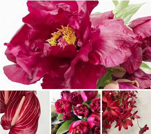
But back to the color. There are two things a person thinks of when they hear the word magenta in the floral biz: magenta with a purple undertone or magenta with a red undertone. There is definitely a huge difference, which is especially important since our industry is based on color. Pantone's color choice is the red undertone which branches into the burgundy and wine realm. This is great for flower lovers as there are tons of magenta-colored flowers.
I think it goes beyond that though. When you have things in nature, especially flowers, there are so many varying shades and layers that could be considered magenta. Let's take the saracena lily. The veining showcases that gorgeous bold color magenta. Then we have this super saturated amaryllis that has an almost black velvet center and graduates to that bright viva magenta hue. Because magenta is the complementary color of green, magenta flowers have the highest contrast with green foliage and therefore are more visible to the animals/insects needed for their pollination.
For more information: Mayesh
www.mayesh.com